Этот скрипт демонстрирует, как можно использовать сверточный автоэнкодер для обнаружения аномалий в данных временных рядов.
Импорты
import osimport random# Ask XLA for deterministic kernels (no device pinning so it works on CPU/GPU/TPU)os.environ.setdefault("XLA_FLAGS", "--xla_gpu_deterministic_ops")import numpy as npimport pandas as pdimport jaximport jax.numpy as jnpfrom flax import linen as nnfrom flax.training import train_stateimport optaxfrom matplotlib import pyplot as pltfrom tqdm.auto import tqdmSEED =42random.seed(SEED)np.random.seed(SEED)
/usr/local/lib/python3.12/dist-packages/jax/_src/cloud_tpu_init.py:86: UserWarning: Transparent hugepages are not enabled. TPU runtime startup and shutdown time should be significantly improved on TPU v5e and newer. If not already set, you may need to enable transparent hugepages in your VM image (sudo sh -c "echo always > /sys/kernel/mm/transparent_hugepage/enabled")
  warnings.warn(
Загрузка данных
Мы будем использовать датасет Numenta Anomaly Benchmark(NAB). Он содержит искусственные данные временных рядов с помеченными аномальными периодами. Данные представляют собой упорядоченные одиночные значения с временными метками.
Мы будем использовать файл nyc_taxi.csv, содержащий данные о количестве пассажиров такси в Нью-Йорке, где пять аномалий происходят во время Нью-Йоркского марафона, Дня благодарения, Рождества, Нового года и снежной бури. Исходные данные предоставлены Комиссией по такси и лимузинам Нью-Йорка. Представленные здесь данные состоят из агрегированного общего количества пассажиров такси по 30-минутным интервалам.
import plotly.graph_objs as goimport pandas as pd# Load the dataseturl ="https://raw.githubusercontent.com/numenta/NAB/master/data/realKnownCause/nyc_taxi.csv"df = pd.read_csv(url, parse_dates=True, index_col="timestamp")# Define the anomaliesanomalies = {"NYC Marathon": "2014-11-02 01:00","Thanksgiving": "2014-11-27 16:30","Christmas": "2014-12-25 16:30","New Year's Day": "2015-01-01 01:00","Snow Storm": "2015-01-27 13:30"}# Create the plotfig = go.Figure()# Add the main tracefig.add_trace(go.Scatter(x=df.index, y=df['value'], mode='lines', name='Taxi Passengers'))# Add anomaly points with unique markersmarkers = ['circle', 'square', 'diamond', 'triangle-up', 'triangle-down']for (label, date), marker inzip(anomalies.items(), markers): fig.add_trace(go.Scatter( x=[date], y=[df.loc[date]['value']], mode='markers+text', name=label, text=label, textposition="top center", marker=dict(symbol=marker, size=10, color='red') ))# Update layoutfig.update_layout( title='New York City Taxi Passengers with Anomalies Highlighted', xaxis_title='Date', yaxis_title='Number of Passengers', legend_title='Legend', template='plotly_white')# Show the figure# Config for the plotplotly_config = {'displaylogo': False,'toImageButtonOptions': {'format': 'svg', # one of png, svg, jpeg, webp'filename': 'fmin','height': None,'width': None,'scale': 1# Multiply title/legend/axis/canvas sizes by this factor },'modeBarButtonsToRemove': ['select2d', 'lasso2d'],'modeBarButtonsToAdd': ['drawopenpath','eraseshape' ]}# Show the figure with the specified configfig.show(config=plotly_config)fig.write_html("./anomaly_detection.html", config=plotly_config, include_plotlyjs="cdn", full_html=False,)
Предобработка данных
Нам нужно разделить данные на нормальные и данные с аномалиями.
По этой причине мы пропускаем данные с аномалиями +- 1 день
import pandas as pdimport plotly.graph_objs as gofrom datetime import timedelta# Load the dataseturl ="https://raw.githubusercontent.com/numenta/NAB/master/data/realKnownCause/nyc_taxi.csv"df = pd.read_csv(url, parse_dates=True, index_col="timestamp")# Define the anomaliesanomalies = {"NYC Marathon": "2014-11-02 01:00","Thanksgiving": "2014-11-27 16:30","Christmas": "2014-12-25 16:30","New Year's Day": "2015-01-01 01:00","Snow Storm": "2015-01-27 13:30"}# Convert anomaly dates to datetimeanomaly_dates = [pd.to_datetime(date) for date in anomalies.values()]# Function to split the data into continuous segmentsdef split_data(data, anomaly_dates, window=timedelta(days=1)): segments = [] current_segment = []for date, row in data.iterrows():# if we are in the window before the segment, we go to the next segmentifany(abs(date - anomaly_date) <= window for anomaly_date in anomaly_dates):if current_segment: segments.append(pd.DataFrame(current_segment)) current_segment = []# else we fill the current segmentelse: current_segment.append(row)if current_segment: segments.append(pd.DataFrame(current_segment))return segments# Split the normal datanormal_segments = split_data(df, anomaly_dates)# Split the anomaly dataanomaly_window = timedelta(days=1)anomaly_segments = []for anomaly_date in anomaly_dates: segment = df[(df.index >= anomaly_date - anomaly_window) & (df.index <= anomaly_date + anomaly_window)] anomaly_segments.append(segment)# Create the plotfig = go.Figure()# Add the normal data segments with legendgroupfor i, segment inenumerate(normal_segments): fig.add_trace(go.Scatter( x=segment.index, y=segment['value'], mode='lines', name='Normal Data'if i ==0elseNone, legendgroup='Normal Data', line=dict(color='blue'), showlegend=i ==0 ))# Add the anomaly data segments with legendgroupfor i, segment inenumerate(anomaly_segments): fig.add_trace(go.Scatter( x=segment.index, y=segment['value'], mode='lines', name='Anomaly Data'if i ==0elseNone, legendgroup='Anomaly Data', line=dict(color='red'), showlegend=i ==0 ))# Update layoutfig.update_layout( title='New York City Taxi Passengers with Anomalies Highlighted', xaxis_title='Date', yaxis_title='Number of Passengers', legend_title='Legend', template='plotly_white')# Config for the plotconfig = {'displaylogo': False,'toImageButtonOptions': {'format': 'svg', # one of png, svg, jpeg, webp'filename': 'fmin','height': None,'width': None,'scale': 1# Multiply title/legend/axis/canvas sizes by this factor },'modeBarButtonsToRemove': ['select2d', 'lasso2d'],'modeBarButtonsToAdd': ['drawopenpath','eraseshape' ]}# Show the figure with the specified configfig.show(config=config)
Создание датасета
Давайте создадим датасет из нормальных данных для обучения модели автоэнкодера
Для этого нам нужно
Нормализовать данные, вычитая среднее значение и деля на стандартное отклонение
Определить переменную TIME_STEPS = 100, разбить точки данных (без аномалий) на фрагменты размера TIME_STEPS и поместить их в массив x_train размера (, TIME_STEPS), где обозначает общее количество полученных фрагментов.
df_normalized = dfdf_normalized['value'] = (df['value'] - df['value'].mean()) / df['value'].std()# Split the normal datanormal_segments = split_data(df_normalized, anomaly_dates)# Normalize each segment separatelydef normalize_segment(segment): mean_value = segment['value'].mean() std_value = segment['value'].std()return (segment['value'] - mean_value) / std_valuenormalized_segments = [normalize_segment(segment) for segment in normal_segments]# Define the TIME_STEPSTIME_STEPS =100# Function to create overlapping chunks from each segmentdef create_chunks(segment, time_steps): chunks = [] segment_values = segment.valuesfor i inrange(len(segment_values) - time_steps +1): chunks.append(segment_values[i: i + time_steps])return chunks# Create chunks from each normalized segmentx_train = []x_full = []for segment in normalized_segments: chunks = create_chunks(segment, TIME_STEPS) x_train.extend(chunks)x_full = create_chunks(df_normalized, TIME_STEPS)x_train = np.array(x_train)x_full = np.array(x_full)[:,:,0]# Print the shape of x_trainprint(f'x_train shape: {x_train.shape}')print(f'x_full shape: {x_full.shape}')
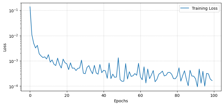
import numpy as npfrom tqdm import tqdmimport matplotlib.pyplot as pltdef create_train_state(rng, learning_rate, model, x): params = model.init(rng, x) tx = optax.nadam(learning_rate)return train_state.TrainState.create(apply_fn=model.apply, params=params, tx=tx)def mse_loss(params, batch, model):def loss_fn(params): reconstruction = model.apply(params, batch)return jnp.mean((batch - reconstruction) **2)return jax.value_and_grad(loss_fn)(params)@jax.jitdef train_step(state, batch): loss, grads = mse_loss(state.params, batch, Autoencoder()) state = state.apply_gradients(grads=grads)return state, loss# Set training parametersn_epochs =100batch_size =128learning_rate =1e-3# Initialize model and statex = jnp.ones((batch_size, TIME_STEPS, 1))state = create_train_state(rng, learning_rate, Autoencoder(), x)# Training looplosses = []for epoch in tqdm(range(n_epochs)): epoch_losses = []for i inrange(0, len(x_train), batch_size): x_batch = x_train[i:i + batch_size]if x_batch.shape[0] != batch_size: # Skip the last batch if it is smaller than batch_sizecontinue state, loss = train_step(state, x_batch) epoch_losses.append(loss) losses.append(np.mean(epoch_losses))# Plot the training loss curveplt.figure(figsize=(9, 4))plt.semilogy(losses, label='Training Loss')plt.xlabel('Epochs')plt.ylabel('Loss')plt.grid(linestyle=":")plt.legend()plt.show()
100%|██████████| 100/100 [00:04<00:00, 20.65it/s]
Обнаружение аномалий
Мы будем обнаруживать аномалии, определяя, насколько хорошо наша модель может восстановить входные данные.
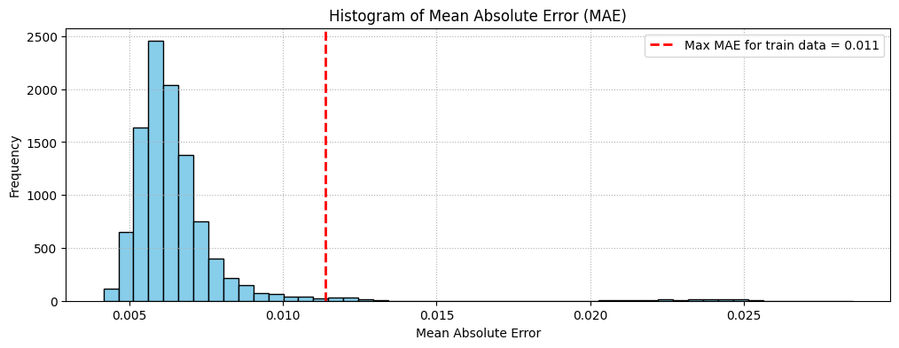
Найти потери MAE на обучающих выборках.
Найти максимальное значение потерь MAE. Это худший результат восстановления семпла нашей моделью. Мы сделаем это значение threshold для обнаружения аномалий.
Если потери восстановления для семпла превышают это значение threshold, мы можем сделать вывод, что модель видит паттерн, с которым она не знакома. Мы пометим этот семпл как anomaly.
import matplotlib.pyplot as pltimport jax.numpy as jnp# Function to calculate MAEdef calculate_mae(params, data, model): reconstructed = model.apply(params, data) mae = jnp.mean(jnp.abs(data - reconstructed), axis=(1, 2))return mae# Calculate MAE for x_trainmae_train = calculate_mae(state.params, x_train, Autoencoder())treshold = jnp.max(mae_train)# Calculate MAE for x_fullmae_full = calculate_mae(state.params, x_full, Autoencoder())# Plot histogram of MAE for x_fullplt.figure(figsize=(12, 4))plt.hist(mae_full, bins=50, color='skyblue', edgecolor='black')plt.axvline(treshold, color='red', linestyle='dashed', linewidth=2, label=f'Max MAE for train data = {treshold:.3f}')plt.xlabel('Mean Absolute Error')plt.ylabel('Frequency')plt.title('Histogram of Mean Absolute Error (MAE)')plt.legend()plt.grid(linestyle=":")plt.show()
Сравнение восстановления
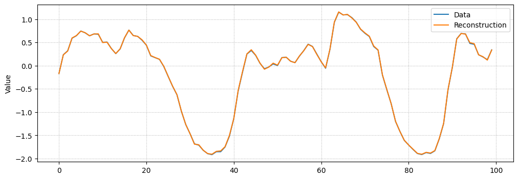
Просто ради интереса, давайте посмотрим, как наша модель восстановила случайный семпл из датасета.
# Checking how the first sequence is learntindex = np.random.randint(len(x_full))plt.figure(figsize=(12, 4))plt.plot(x_full[index], label="Data")prediction = model.apply(state.params, x_full[index])plt.plot(prediction, label="Reconstruction")plt.ylabel("Value")plt.xlabel("")plt.legend()plt.grid(linestyle=":")plt.show()
Визуализация аномалий
import plotly.graph_objs as goimport pandas as pdimport numpy as np# Load the dataset# url = "https://raw.githubusercontent.com/numenta/NAB/master/data/realKnownCause/nyc_taxi.csv"# df = pd.read_csv(url, parse_dates=True, index_col="timestamp")# df_normalized = df# df_normalized['value'] = (df['value'] - df['value'].mean()) / df['value'].std()# Define the anomaliesanomalies = {"NYC Marathon": "2014-11-02 01:00","Thanksgiving": "2014-11-27 16:30","Christmas": "2014-12-25 16:30","New Year's Day": "2015-01-01 01:00","Snow Storm": "2015-01-27 13:30"}# Create the plotfig = go.Figure()# Add the main tracefig.add_trace(go.Scatter(x=df_normalized.index, y=df_normalized['value'], mode='lines', name='Taxi Passengers'))# Add anomaly points with unique markersmarker ='square'for (label, date) in anomalies.items(): fig.add_trace(go.Scatter( x=[date], y=[df_normalized.loc[date]['value']], mode='markers+text', name=label, text=label, textposition="top center", marker=dict(symbol=marker, size=10, color='red') ))anomaly_indices = np.where(mae_full > treshold)[0]# Add predicted anomalies with red markersfor i in anomaly_indices: date = df_normalized.index[int(i + TIME_STEPS/2)] fig.add_trace(go.Scatter( x=[date], y=[df_normalized.loc[date]['value']], mode='markers', name='Predicted Anomaly'if i == anomaly_indices[0] elseNone, legendgroup='Predicted Anomaly', marker=dict(symbol='x', size=10, color='red'), showlegend =bool(i == anomaly_indices[0]), ))# Update layoutfig.update_layout( title='New York City Taxi Passengers with Anomalies Highlighted', xaxis_title='Date', template='plotly_white')# Show the figureplotly_config = {'displaylogo': False,'toImageButtonOptions': {'format': 'svg', # one of png, svg, jpeg, webp'filename': 'fmin','height': None,'width': None,'scale': 1# Multiply title/legend/axis/canvas sizes by this factor },'modeBarButtonsToRemove': ['select2d', 'lasso2d'],'modeBarButtonsToAdd': ['drawopenpath','eraseshape' ]}# Show the figure with the specified configfig.show(config=plotly_config)fig.write_html("./anomaly_detection.html", config=plotly_config, include_plotlyjs="cdn", full_html=False,)
Unable to display output for mime type(s): application/vnd.plotly.v1+json
Как мы видим, метод обнаружил 4 из 5 аномалий на GPU, что является неплохим результатом, учитывая простоту решения и сложность данных!
Задача:
Решение по умолчанию использует nadam, и после обучения оно может обнаружить 4 из 5 аномалий на GPU. Теперь используйте методы из описания домашней работы для обучения модели. Нужно найти гиперпараметры для метода которые обеспечивают обнаружение как минимум 3 из 5 аномалий при примерно тех же конечных потерях на обучении.
Результаты могут отличаться в зависимости от устройства, которое вы исползуете: CPU/GPU/TPU. Поэтому в клетке ниже укажите, какое устройство вы использовали для получения конечного результата.